
A Neural Network Regression goes Terribly Wrong!
Note: If you use our diagrams / blog article for your work, please cite the blog page. We work hard to write this content to help the knowledge percolate in a faster way to the learners.
Counterexamples are the best way to understand what's wrong, and what's right, what works, and what doesn't work. I will take the example of a simple linear regression, and if applied as a neural network can go terribly wrong.
The Fundamental Picture of Machine Learning Algorithm
The following picture will explain you the steps of building a ML algorithm. The most important step is the data generation process, which can make a model behave in different ways.

Neural Network, Model, and Simple Linear Regression
Neural Network plays its big role in making a pretty good model. It doesn't say anything about the data generation process. There is exactly where the problem lies if you do not know your data well. In this post, it is being shown how a Neural Network can copy the model of the Linear Regression, i.e. the mathematical function of the simple linear regression. Remember, that simple linear regression has an extra assumption of the data generation process that the errors $\epsilon_i$ or the $Y_i | X_i = x_i$ follows a normal distribution. This has an impact on the loss function. Let me tell you with a set of examples.
Data Generation Process, and Loss Function
For example, a simple linear neural network with square loss function is equivalent to the simple linear regression with normality assumption, and maximum likelihood based loss function. simple linear neural network with absolute loss function is equivalent to the simple linear regression with Laplace distribution assumption, and maximum likelihood based loss function. A simple linear neural network with $L_1$ regularised loss function is equivalent to the simple linear regression with the linear coefficient following normality prior, and maximum likelihood-based loss function. There are lots of examples. This implies that the data generation process has a serious impact on the loss function. I will write an article on this separately in the upcoming days.
This is how a Simple Linear NN Model can go wrong!
- I simulate a bivariate $(x,y)$ dataset of sample size 100.
- I take the model and data generation process as $Y \mid X = x \sim f(x) + T(\text{df} = 1)$, where $f(x) = wx + b$.
- $T(\text{df} = 1)$ is the T distribution with degree of freedom = 1.
- Then, I applied a simple linear neural network with square loss function. Remember this is equivalent to a simple linear regression with normality assumption. Therefore, in the code I have used a simple linear regression to model it.
- Thus, it terribly goes wrong. Absolutely, wrong! Let me show you below.
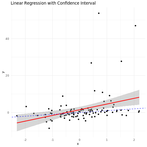
The blue line is not even in the 95% confidence interval of the actual model. However, you can argue that there are outlier points. Thus, it is causing the issue. You will remove the outlier, and the model will work fine. I mean, you can always manipulate the data to make it work like you want, instead of actually admitting that you are fitting the wrong model. This tells you the significance of knowing how the data has been acquired, and then apply physical laws, principles, and domain knowledge to model it accordingly, and make a proper loss function. This is fundamentally important to perceive.
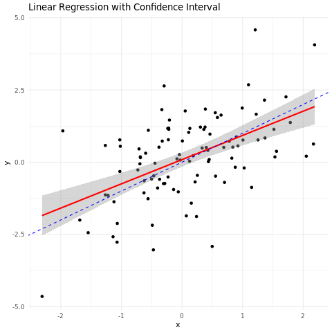
Things are different if you increase the Degrees of Freedom
However, if you increase the degrees of freedom of a t distribution, which exists as the error distribution of the data generation process. The reason is that as you increase the degrees of freedom, the t distribution converges to a standard normal distribution. I have proved it mathematically below.
T distribution converges to Standard Normal as the degrees of freedom increase
Let $T_n$ have a $t$ distribution with $n$ degrees of freedom. Then by definition
$$
T_n=\frac{X}{\sqrt{ } \overline{Y_n / n}}
$$
, where $X \sim N(0,1)$ is independent of $Y_n \sim \chi_n^2$.
Since $Y_n$ is distributed as $\sum_{i=1}^n X_i^2$ where $X_i$ 's are i.i.d standard normal, by law of large numbers
$$
\frac{Y_n}{n} \stackrel{P}{\rightarrow} E\left(X_1^2\right)=1
$$
Therefore,
$$
\sqrt{Y_n / n} \stackrel{P}{\longrightarrow} 1
$$
Hence,
$$
X \stackrel{L}{\rightarrow} N(0,1)
$$
Applying Slutsky's theorem on the previous two equations, it follows that
$$
T_n \stackrel{L}{\rightarrow} N(0,1)
$$
Code for the above model, and plot
# Step 1: Draw 100 samples of x from a normal distribution
set.seed(123)  # for reproducibility
x <- rnorm(100)

# Step 2: Draw 100 samples of error from a Student's t distribution with mean 0
error <- rt(100, df = 1)  # Adjust the degrees of freedom (df) as needed

# Step 3: Define y as the sum of x and the error
y <- x + error

# Step 4: Fit a linear regression model with (x, y)
lm_model <- lm(y ~ x)

# Print the summary of the linear regression model
summary(lm_model)

# Load the ggplot2 library
library(ggplot2)

# Create a data frame with x and y values
data_df <- data.frame(x = x, y = y)

# Fit the linear regression model
lm_model <- lm(y ~ x, data = data_df)

# Create a ggplot object with scatter plot, regression line, and actual data generation process line
p <- ggplot(data_df, aes(x = x, y = y)) +
  geom_point() +
  geom_smooth(method = "lm", se = TRUE, color = "red") + # Add regression line with confidence interval
  geom_abline(intercept = 0, slope = 1, linetype = "dashed", color = "blue") + # Actual data generation process line
  labs(title = "Linear Regression with Confidence Interval", x = "x", y = "y") +
  theme_minimal()

# Print the ggplot object
print(p)
I hope it helps you understand. Let us know in the comments if you have doubts, or if you have other conceptual questions. We would love to write articles on the same.